NordPett
Summary
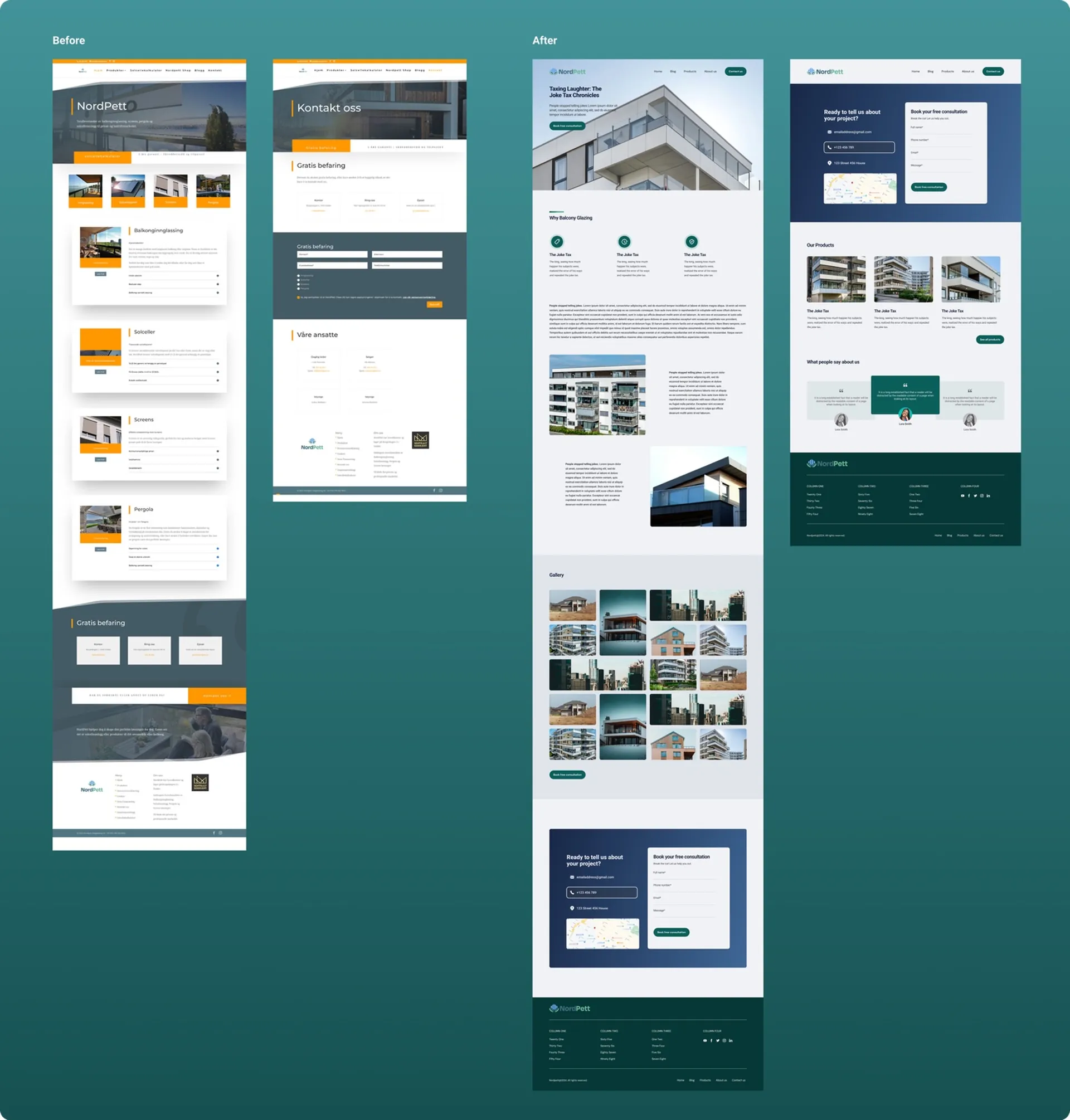
The NordPett website redesign was an opportunity to elevate a luxury home improvement brand and craft a digital experience that reflected the quality, trust, and elegance of its balcony glazing solutions.
As the sole UX Designer, I aimed to create a visually stunning, conversion-driven, and user-centric website that transformed casual visitors into leads by encouraging them to schedule free consultations.
This involved rethinking the information architecture, navigation, and visual hierarchy to better align with the luxury market while ensuring a consistent, year-round appeal to both homeowners and housing associations.
Role 👩🏻
UX Designer
Timeframe ⏳
2 weeks
Tools 🛠️
Figma
Understanding the Challenge 🧐
Despite offering premium glazing solutions, NordPett’s original website failed to communicate its value or convert visitors effectively. The audit identified several key issues:
- Low Conversions: The consultation form was hidden and poorly designed, leading to missed lead opportunities.
- Outdated Visuals: The design lacked sophistication, undermining brand credibility and trust.
- Confusing Navigation: A cluttered layout made it difficult for users to find relevant information.
- Seasonal Drop-Offs: Engagement peaked in summer but dropped sharply during other seasons.
- Poor Mobile Experience: The site wasn’t responsive, frustrating the growing base of mobile users.
The main challenge was clear: create a modern, conversion-optimised, and accessible digital experience without losing the brand’s established identity.
Solution 🎯
I approached the redesign with one goal: to craft an experience that was visually refined, strategically structured, and focused on lead generation.
Five key objectives shaped the redesign:
- Streamlined Navigation: Simplify the journey with intuitive menus and clear user flows.
- Luxury-Oriented Aesthetic: Reflect NordPett’s premium craftsmanship with a polished, minimal interface.
- Conversion Focus: Integrate CTAs prominently throughout the site to encourage consultation sign-ups.
- Seasonal Engagement: Showcase how balcony glazing adds value year-round, not just in warm months.
- Mobile Responsiveness: Optimise layouts for all devices to improve usability and consistency.
The result was a strategic balance of design and functionality, creating a site that not only looks luxurious but performs effectively.
UX Research 🔎
To ensure the redesign aligned with both user goals and business objectives, I conducted several research activities:
Competitor Analysis
I examined leading luxury glazing and home improvement websites to identify design trends and best practices.
Insights included:
- The power of hero imagery to communicate quality.
- The importance of clear value propositions above the fold.
- The impact of CTA visibility on conversion performance.
User Personas
Two main personas guided the design direction:
- Homeowners: Affluent individuals (35–60 years old) seeking stylish, functional upgrades for their properties.
- Housing Association Board Members: Decision-makers responsible for managing large-scale property renovations.
Heuristic Review
A usability audit of the existing site highlighted:
- Overcomplicated menus and redundant links.
- Ineffective CTA placement and weak visual hierarchy.
- Cluttered layouts that obscured key information.
These findings informed the structural and visual improvements in the next design phase.
Design Solution 💡
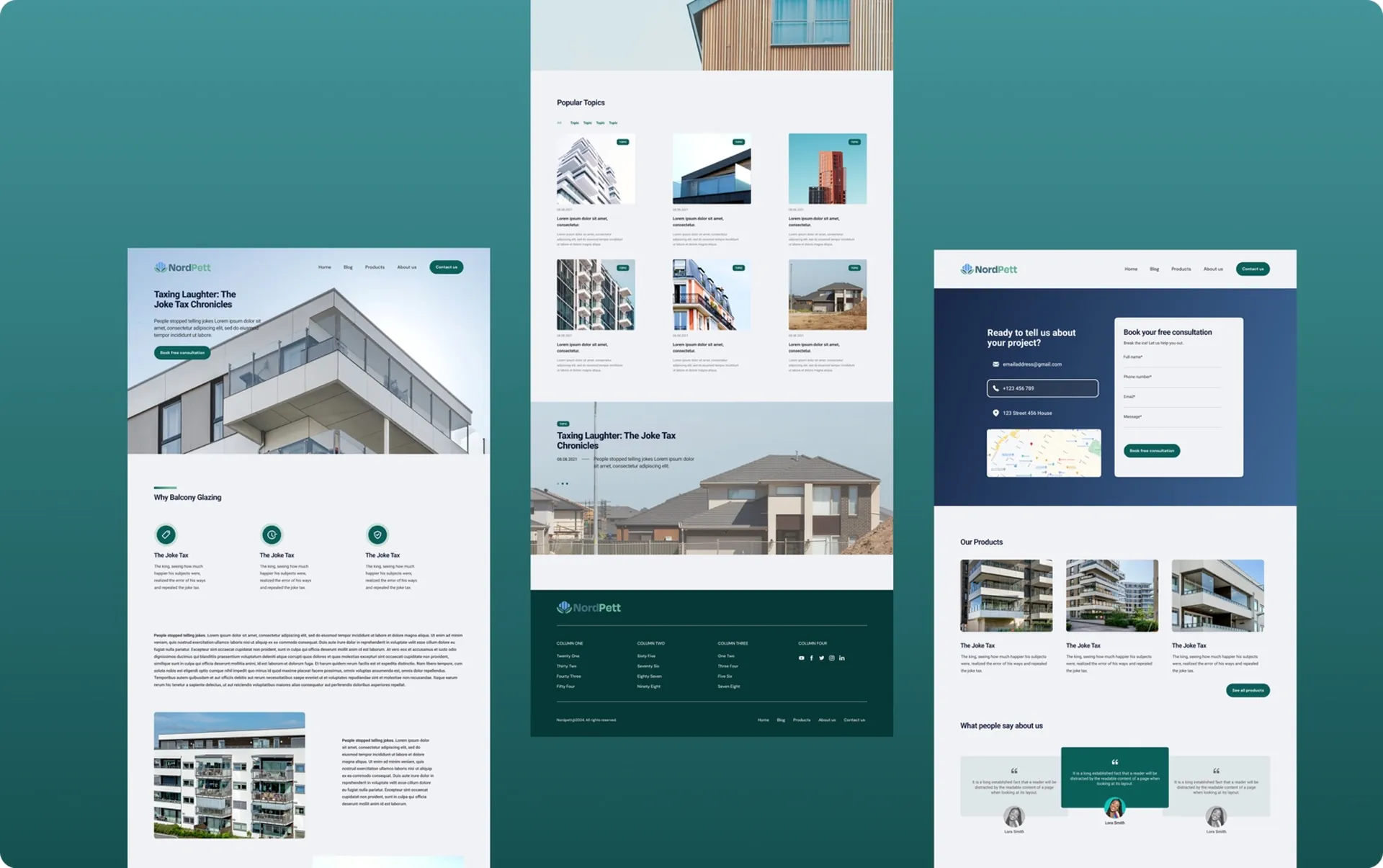
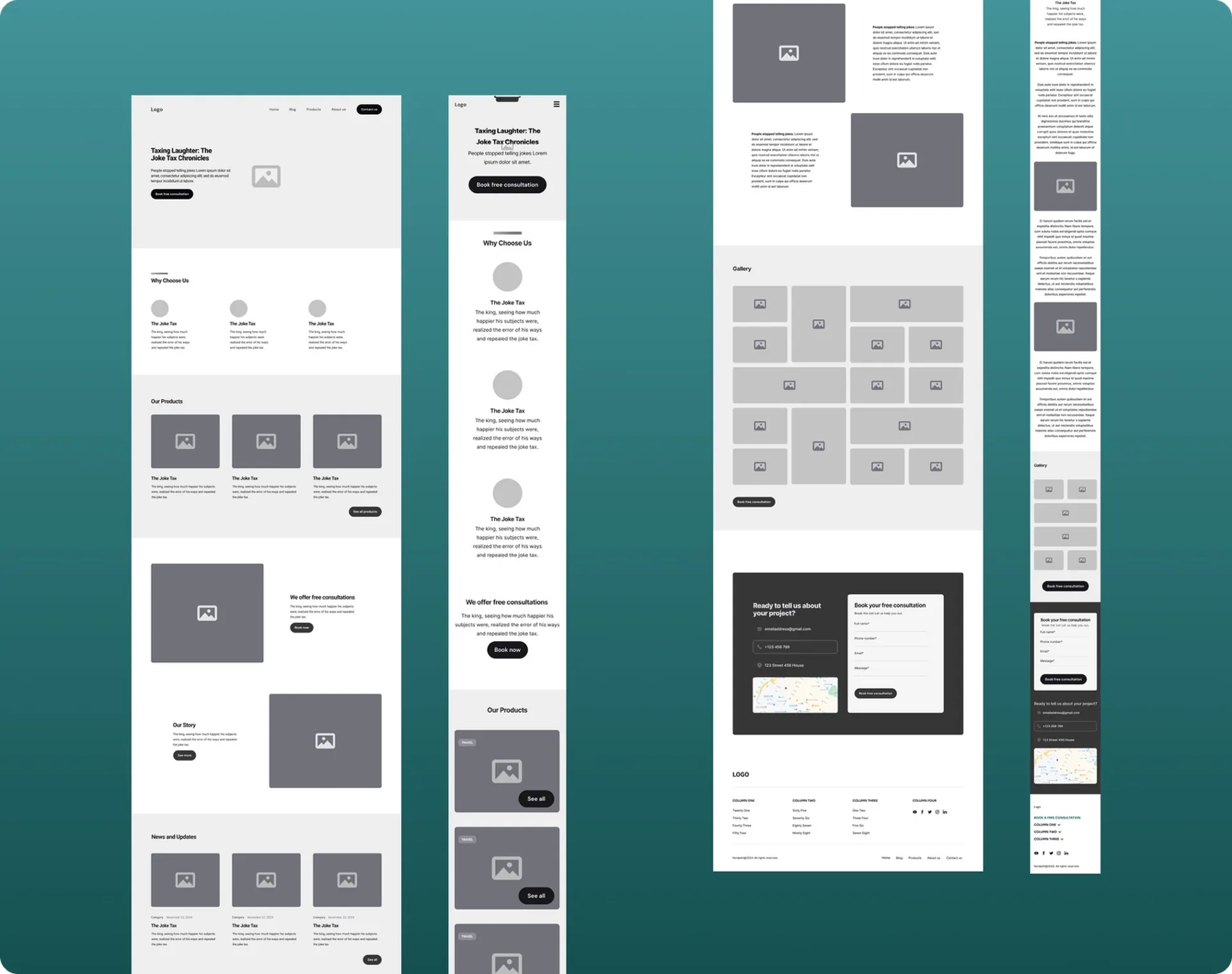
Information Architecture & Wireframing
Low-fidelity wireframes were developed for both desktop and mobile to define layout flow and prioritise content.
Key pages included:
- Homepage: A strong hero message, value-driven CTA, seasonal benefits, and testimonials.
- Product Page: Focused on product benefits, visuals, and technical specifications to drive informed decisions.
- Contact Page: Simplified form with minimal fields to reduce friction and improve submission rates.
- Blog: Categorised content by season and lifestyle for ongoing engagement.
- About Page: Highlighted brand heritage, craftsmanship, and trust signals.
Wireframes were presented to and approved by the client before moving to the high-fidelity stage.
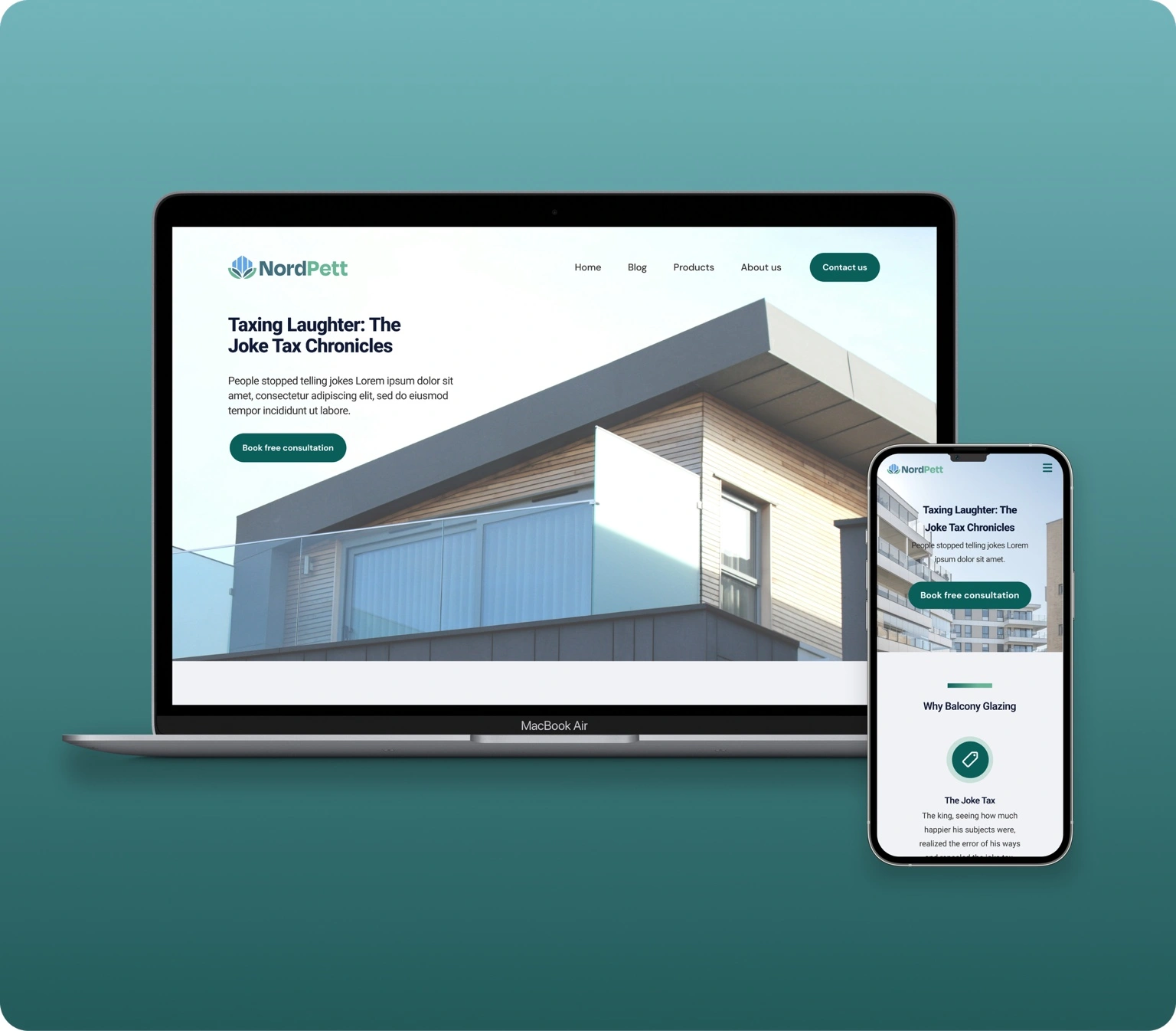
Visual Design
The visual design system was crafted to evoke sophistication while staying clean and accessible.
- Elegant Colour Palette: Soft neutrals balanced with deep greens and blues to convey trust, luxury, and reliability.
- High-Quality Imagery: Full-width visuals showcased glazed balconies in aspirational settings, reinforcing the premium lifestyle appeal.
- Clean Layouts: Minimalist composition and ample white space improved readability and reinforced an upscale aesthetic.
Every element—from typography to spacing—was guided by the principle of luxury through simplicity.
Key Learnings ✍️
Collaboration is Key:
Throughout the project, I learned the importance of frequent and open communication with the client. Regular feedback and check-ins ensured that the design direction aligned with the company’s vision and goals. This collaboration allowed for adjustments early in the process, minimising the need for major revisions later. Understanding the client’s needs in detail—especially in terms of their luxury brand identity—was critical to creating a design that met both their aesthetic and functional requirements.
Simplicity Drives Impact:
One of the most valuable lessons I took away was the power of simplicity. By stripping away unnecessary elements and focusing on clean, streamlined layouts, the site became more user-friendly and visually appealing. Minimalist design not only enhanced the overall aesthetic but also improved functionality, guiding users seamlessly toward key actions like signing up for consultations. A clutter-free experience proved essential in creating the luxurious feel the client desired.
Strategic Placement of CTAs Drives Conversions:
The project reinforced the importance of strategic CTA placement. By ensuring that CTAs were not only visually prominent but also contextually relevant (e.g., after discussing product benefits or testimonials), I learned how to guide users more effectively toward the desired actions. This method proved crucial in driving higher conversion rates, as users were presented with clear and persuasive opportunities to engage at every touchpoint.
What the client says 💭
Working with Clara has been an absolute pleasure! She exceeded our expectations, delivering a professional redesign perfectly aligned with our rebranding. Clara’s cooperation, quick responsiveness, and timely delivery made the process seamless. We’re VERY HAPPY with the final product. Thank you! 🙌