
High Court
Summary
In collaboration with Cofluence, I led the UX design for the High Court’s website redesign, a project aimed at modernising an online presence that hadn’t been updated in over 15 years.
Given the highly confidential nature of the project, all identifying imagery, references, and logos were removed from the final mockups shown below.
My role was to design a series of developer-ready desktop mockups that reflected the client’s need for modern usability while maintaining the heritage of the institution. The work required striking a delicate balance — enhancing usability and accessibility without compromising the High Court’s traditional identity.
Role 👩🏻
UX Designer
Timeframe ⏳
4 months
Tools 🛠️
- Figma
- Zoom
- Dropbox
UI Kit 🎨
Open source template named “CivicTheme" developed by Salsa Digital
Understanding the Challenge 🧐
The High Court’s existing website had remained largely unchanged for over a decade, creating a dual challenge of modernising the user experience while preserving the institution’s authority and legacy.
Key challenges identified:
- Balancing Tradition with Modernisation: The redesign needed to improve navigation and usability while preserving a timeless, formal aesthetic aligned with the High Court’s stature.
- Strict Confidentiality: No official branding, imagery, or assets could be shared, requiring all designs to remain generic yet representative of the final outcome.
- Client Conservatism: The client’s cautious approach meant that every design decision had to be backed by reasoning, empathy, and respect for their heritage.
This project demanded not just design skill, but diplomacy, attention to detail, and trust-building with the stakeholders involved.
Solution 🎯
The final solution was a refreshed website concept that prioritised clarity, accessibility, and structure, while subtly updating the visual language to feel more current and intuitive.
Key improvements included:
- A redesigned navigation bar with clearly defined sections and dropdowns for subcategories.
- Breadcrumb trails to support orientation and reduce cognitive load.
- A refined colour palette derived from the High Court’s architectural tones, reinforcing continuity between the digital and physical experience.
- Integration of CivicTheme UI components for consistent and accessible design standards.
Each element was documented and specified for handoff, ensuring the designs were developer-ready and easy to implement.
UX Research 🔎
Cofluence provided a detailed client brief outlining the High Court’s expectations. My role involved translating these requirements into actionable UX design principles.
Core research insights:
- Modernisation with Restraint: Visual updates needed to reflect progress without alienating a conservative audience.
- Improved Navigation: The site’s structure had to accommodate diverse users — from legal professionals to the public — through intuitive pathways.
- Clear Content Hierarchy: Prioritising information was essential for users seeking decisions, case updates, or court listings.
By understanding these priorities, the design direction balanced clarity, hierarchy, and accessibility within a dignified visual framework.
Design Solution💡
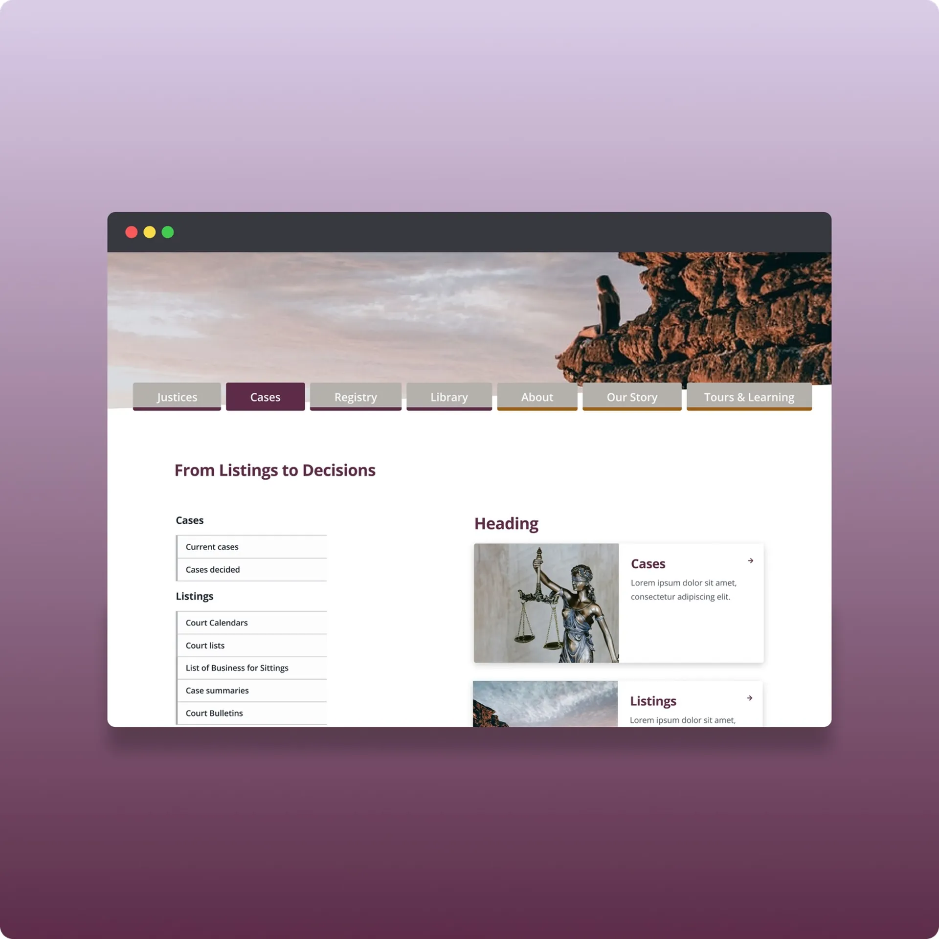
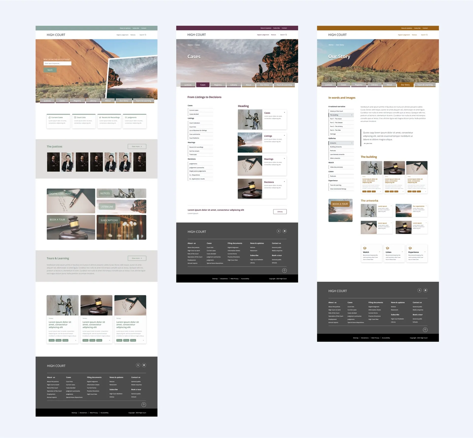
Redesigned main navigation bar with clearly defined buttons
The website's navigation was designed to improve user experience without overwhelming the traditional design. The main navigation bar featured clearly defined buttons, with dropdown menus that expanded to reveal subcategories. This structure allowed users to easily find the information they needed while maintaining a clean and organised layout.

Implemented dropdown menus for expanded subcategories
Dropdown menus were designed to offer clear categorisation of content, enabling users to easily access various sections of the website. Each dropdown was organised by relevant topics and subcategories, reflecting the site's overall content hierarchy.

Added breadcrumb trails for easy navigation and context
The information on the website was organised into a clear hierarchy, signifying the importance of content through visual cues. Larger images were used on higher-level pages to draw attention to critical information, while smaller images and text were used for less critical content.

This approach ensured that users could quickly grasp the significance of the content on each page, improving overall usability. Moreover, the breadcrumbs provided feedback to the users on the pages navigated up until that moment.

Colour Palette and Aesthetic Consistency
The colour scheme was derived from the primary colours found in the High Court building, both inside and outside. These colours were applied consistently across the website to create a cohesive and respectful visual identity that resonated with the institution's traditional values.
The use of these colours not only reinforced the connection to the High Court's physical space but also added a sense of continuity between the old and new designs.
CivicTheme UI Kit Integration
The "CivicTheme" UI kit provided by Cofluence was a solid foundation for the design, ensuring consistency and accessibility. I customised the elements from the kit to align with the High Court’s traditional aesthetic, added content provided by Cofluence and modified fonts.

The final design solution not only met the High Court's cautious approach to change but also provided a modern, user-friendly experience that preserved the institution's identity. The mockups were developer-ready, with all design elements clearly specified, ensuring a smooth transition to the implementation phase.
Key Learnings ✍️
Navigating Client Conservatism: Designing for a client with a strong attachment to tradition, such as the High Court, required a deep understanding of their values and cautious approach to change. This experience reinforced the importance of balancing innovation with respect for established norms.
Effective Collaboration: Working closely with Cofluence highlighted the importance of clear and consistent communication, especially in a project with high confidentiality. Regular Zoom calls and well-organised revision notes shared via Dropbox were crucial in maintaining alignment and ensuring that the design met Cofluence’s and their client expectations.
Developer-Ready Design: Ensuring that the mockups were ready for developers emphasised the importance of creating designs that are not only visually appealing but also practical for implementation. This involved careful documentation of all components, making the handover process smooth and efficient.
What the client says 💭
Clara developed a suite of website mockups for Cofluence to our brief for a high profile client. She was extremely collaborative, courteous and professional even when we were being a little demanding with changes! It was a complex brief but she delivered an excellent result and our client is impressed. Due to delays at our end I t took much longer than the initial agreement but Clara was patient and proactively helpful. I recommend her without reservation.